Wednesday, 28 November 2012

Final design for poster


The reason we decided to go with this design was because we wanted to make sure we had enough brand identity. So we went for the same image we used on the front of our CD cover and also the same font and sized writing and we also had the same company logos. we also added websites we had on our album cover.  We didn't bother putting in the copyright info because looking at professional digipaks, we noticed that not a lot of posters had copyright info and we also added in the places where you can buy/download the song (iTunes and HMV).

Tuesday, 27 November 2012

Drafts

Here was Will's idea with the use of the silhouetted image, this keeps to brand identity because it is the same image as the one on the front of the digipak. He wanted to add the name of song and title along the right side. He decided to tilt the title so it was vertical. He also added the production logo's at the bottom left with the possible copyright, websites and information.

Here is James's idea, he has done the same thing as Will, but has added another image at the bottom, of the male and female actor looking separate ways in front of the fire. He has also added the Production logos on the right and shop logos on the left. He has also added the possible copyright info at bottom center. The title and out now is positioned at the top center. The other two band members have been placed at the top left and right corners. 

This image is in the filming with the singer playing piano and the purple light showing on the edge of his head. I have added the information across the bottom of the poster. To keep to brand identity I put the digipak at the bottom right of the poster. The title across the top.

This is the same image as the first two but the singer cut out so its just the flames, this connects the poster image to the digipak poster. The title across the top centered to the page.

Monday, 26 November 2012

Past student poster analysis

Pass out:


Digipak


                                                                                      Poster


Conventions used:
  • Name of artist
  • Name of album
  • Date of release
  • Company logo
  • Website 
  • Brand identity

What is good about the poster:
The poster in its own right does use brand identity because on the album the artist is on the front cover, this can create the link between them. They have I believe positioned text to fit the image perfectly. The title of the song in huge red letters catches the eye and creates interest to the image. They have used many conventions creating a clear point about who they are and what they are.
The white background creates a good base layer for contrasting which is always a good and simple way to attract the eye. The singers have been dressed in the stereotypical way, hoodies, smart but casual shirt and jumper, the singer on the right has got his untucked stopping the clothing from being too smart. The posses that they are in are 'rap like' with a laid back style with there hands at the middle of the body looking neutral, but at the same time there expressions of the hands look as if the mean business. The font used is basic but effectively big to catch attention. this all I think complies with the genre.

What is bad:
Perhaps make the brand identity clearer or add the digipak front cover bellow the date of release. Even though the white back ground helps with contrast it can also play havoc with Photoshop and cutting the two singers out, They have taken their time on it and done it very well but possibly smooth the edges and add a shadow effect to get rid of the 'fake' studio look.

Poster analysis 2

 Pendulum

 Digipack


                                                                      Poster


Conventions met:
  • Name of artist
  • Name of album
  • Brand identity
  • Release date
  • Website
  • Company logo's
What is good about the poster:
As you can see above they tick many of the boxes above for the conventions of magazine adverts. This means the audience knows when, where and what to look for. The brand identity is simply the front cover of the album keeping it simple with little confusion  They also include their company logos at the bottom of the poster so they get their recognition. Their website has been made large and in red so passers by read it and subconsciously take it in. The art work is very colourful with reds, yellows,greens,and blues. The pattern on the outside of the circle are electrical circuits, this is a direct link to there genre of 'Electronic Rock'. There is a baby in the centre of the circle this has many different interpretations. One of them possibly being the birth of something new, a new type of music. The Font at the top is put there so it is out the way of the image and artwork. It is also the first text you look at, the eye would then move down over the image to the rest of the writing.


What is bad:
It is over crowded with text at the bottom with information about what is inside the album, I don't think this is really needed. This would make the people passing by have to stop to read it. However they do combat this with the large red writing showing their website. 

Poster analysis 1


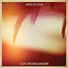
Kings of Leon


Digipack


                                                             Poster


Conventions met:
  • Brand identity.
  • Name of band.
  • Name of album.


What is good about the poster:
With minimal to no information this would be a great poster to use by roads or places which are passed at speed. This is because the shattering bulb at the top matches the one of the album establishing the brand identity. The x-ray of a skull attracts the eye simply because of its size and the contrast of white on black. There are conventions of both the skull and light bulb. A light bulb can be seen as a new idea in this case that new idea could be shattered, or it could mean light. The breaking of it going into darkness or a place no one else has gone before. The skull can mean death or fear these comply with the idea of the bulb, 'death of an idea?' or 'fear of the unknown'. These are in my idea negative thoughts, and don't comply with the genre.


What is bad:
Because of the minimalistic approach it doesn't give the audience much information, no date of release, no recommended place to buy it and no website to visit. I think that simple can be best however when it is this simplistic I don't think it is effective or helpful. Therefore when looking to do simplistic beware of missing important conventions.

Sunday, 25 November 2012

Conventions of Magazine Adverts


  • Name of the album
  • Name of the artist
  • Release date
  • Brand identity
  • Website
  • Company logo
  • Song names
  • Tour dates
  • Magazine/ Newspaper rating
  • The shops where you can get them


  • What is a Magazine Advert, and What is Brand Identity?


    A magazine advert is a segment in a magazine that is dedicated to advertise something, for sale or to promote its cause.  In the case of music it usually is to sell the music, or promote the artist/band to its target audience. This would only work if the correct magazine is used to match the songs genre, this would therefore be selecting the target audience. We will be promoting the sale of our music video's digipak to our target audience. This is usually done with the same image that is used for the front of the digipak or a different image with the digipak front cover added somewhere. This is called brand identity, which is important for the audience to connect the advert with the digipak even without having to read it. It also includes the artist/band's name, name of song, date of the release for sale, ratings, websites that they can visit, places you can buy it and the production logo's.

    Here are examples of Brand Identity and adverts for the same artist/band:

    =
    The same colouring and theme is used in both the images to create the visual link, as well as font of the text. The name of band and album name make the link too. As seen at the bottom is the release date, songs featured in it, and record labels.


    Here is Coldplay's:


      =  

    This is very minimal information but it includes both an image of the band, and album cover. It also uses the same font and concept art throughout.

    Guns. N. Roses:

      =  
    They have simply put the albulm cover in the centre striaght away creating an obvious link to the digipak. They have also added images of the band members performing on each corner, also including 'out now'. They promote another product of theirs,'Gn'R DVDs AVAILABLE'.