Wednesday, 28 November 2012

Final design for poster


The reason we decided to go with this design was because we wanted to make sure we had enough brand identity. So we went for the same image we used on the front of our CD cover and also the same font and sized writing and we also had the same company logos. we also added websites we had on our album cover.  We didn't bother putting in the copyright info because looking at professional digipaks, we noticed that not a lot of posters had copyright info and we also added in the places where you can buy/download the song (iTunes and HMV).

Tuesday, 27 November 2012

Drafts

Here was Will's idea with the use of the silhouetted image, this keeps to brand identity because it is the same image as the one on the front of the digipak. He wanted to add the name of song and title along the right side. He decided to tilt the title so it was vertical. He also added the production logo's at the bottom left with the possible copyright, websites and information.

Here is James's idea, he has done the same thing as Will, but has added another image at the bottom, of the male and female actor looking separate ways in front of the fire. He has also added the Production logos on the right and shop logos on the left. He has also added the possible copyright info at bottom center. The title and out now is positioned at the top center. The other two band members have been placed at the top left and right corners. 

This image is in the filming with the singer playing piano and the purple light showing on the edge of his head. I have added the information across the bottom of the poster. To keep to brand identity I put the digipak at the bottom right of the poster. The title across the top.

This is the same image as the first two but the singer cut out so its just the flames, this connects the poster image to the digipak poster. The title across the top centered to the page.

Monday, 26 November 2012

Past student poster analysis

Pass out:


Digipak


                                                                                      Poster


Conventions used:
  • Name of artist
  • Name of album
  • Date of release
  • Company logo
  • Website 
  • Brand identity

What is good about the poster:
The poster in its own right does use brand identity because on the album the artist is on the front cover, this can create the link between them. They have I believe positioned text to fit the image perfectly. The title of the song in huge red letters catches the eye and creates interest to the image. They have used many conventions creating a clear point about who they are and what they are.
The white background creates a good base layer for contrasting which is always a good and simple way to attract the eye. The singers have been dressed in the stereotypical way, hoodies, smart but casual shirt and jumper, the singer on the right has got his untucked stopping the clothing from being too smart. The posses that they are in are 'rap like' with a laid back style with there hands at the middle of the body looking neutral, but at the same time there expressions of the hands look as if the mean business. The font used is basic but effectively big to catch attention. this all I think complies with the genre.

What is bad:
Perhaps make the brand identity clearer or add the digipak front cover bellow the date of release. Even though the white back ground helps with contrast it can also play havoc with Photoshop and cutting the two singers out, They have taken their time on it and done it very well but possibly smooth the edges and add a shadow effect to get rid of the 'fake' studio look.

Poster analysis 2

 Pendulum

 Digipack


                                                                      Poster


Conventions met:
  • Name of artist
  • Name of album
  • Brand identity
  • Release date
  • Website
  • Company logo's
What is good about the poster:
As you can see above they tick many of the boxes above for the conventions of magazine adverts. This means the audience knows when, where and what to look for. The brand identity is simply the front cover of the album keeping it simple with little confusion  They also include their company logos at the bottom of the poster so they get their recognition. Their website has been made large and in red so passers by read it and subconsciously take it in. The art work is very colourful with reds, yellows,greens,and blues. The pattern on the outside of the circle are electrical circuits, this is a direct link to there genre of 'Electronic Rock'. There is a baby in the centre of the circle this has many different interpretations. One of them possibly being the birth of something new, a new type of music. The Font at the top is put there so it is out the way of the image and artwork. It is also the first text you look at, the eye would then move down over the image to the rest of the writing.


What is bad:
It is over crowded with text at the bottom with information about what is inside the album, I don't think this is really needed. This would make the people passing by have to stop to read it. However they do combat this with the large red writing showing their website. 

Poster analysis 1


Kings of Leon


Digipack


                                                             Poster


Conventions met:
  • Brand identity.
  • Name of band.
  • Name of album.


What is good about the poster:
With minimal to no information this would be a great poster to use by roads or places which are passed at speed. This is because the shattering bulb at the top matches the one of the album establishing the brand identity. The x-ray of a skull attracts the eye simply because of its size and the contrast of white on black. There are conventions of both the skull and light bulb. A light bulb can be seen as a new idea in this case that new idea could be shattered, or it could mean light. The breaking of it going into darkness or a place no one else has gone before. The skull can mean death or fear these comply with the idea of the bulb, 'death of an idea?' or 'fear of the unknown'. These are in my idea negative thoughts, and don't comply with the genre.


What is bad:
Because of the minimalistic approach it doesn't give the audience much information, no date of release, no recommended place to buy it and no website to visit. I think that simple can be best however when it is this simplistic I don't think it is effective or helpful. Therefore when looking to do simplistic beware of missing important conventions.

Sunday, 25 November 2012

Conventions of Magazine Adverts


  • Name of the album
  • Name of the artist
  • Release date
  • Brand identity
  • Website
  • Company logo
  • Song names
  • Tour dates
  • Magazine/ Newspaper rating
  • The shops where you can get them


  • What is a Magazine Advert, and What is Brand Identity?


    A magazine advert is a segment in a magazine that is dedicated to advertise something, for sale or to promote its cause.  In the case of music it usually is to sell the music, or promote the artist/band to its target audience. This would only work if the correct magazine is used to match the songs genre, this would therefore be selecting the target audience. We will be promoting the sale of our music video's digipak to our target audience. This is usually done with the same image that is used for the front of the digipak or a different image with the digipak front cover added somewhere. This is called brand identity, which is important for the audience to connect the advert with the digipak even without having to read it. It also includes the artist/band's name, name of song, date of the release for sale, ratings, websites that they can visit, places you can buy it and the production logo's.

    Here are examples of Brand Identity and adverts for the same artist/band:

    =
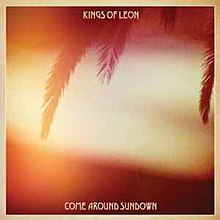
    The same colouring and theme is used in both the images to create the visual link, as well as font of the text. The name of band and album name make the link too. As seen at the bottom is the release date, songs featured in it, and record labels.


    Here is Coldplay's:


      =  

    This is very minimal information but it includes both an image of the band, and album cover. It also uses the same font and concept art throughout.

    Guns. N. Roses:

      =  
    They have simply put the albulm cover in the centre striaght away creating an obvious link to the digipak. They have also added images of the band members performing on each corner, also including 'out now'. They promote another product of theirs,'Gn'R DVDs AVAILABLE'.

    Ancillary Task 2 Brief

    A magazine advertisement for the digipak (CD/DVD package)

    Thursday, 22 November 2012

    Final Digital Digipak


    The reason we chose this as our front and back cover was because we liked the silhouette in front of the fire and the fact that to the left of the fire it appears as a shape similar a griffin and the reason we liked the back was because we used a drum with water on it in our video and it was one of the better ideas we had but this time we used a red light to keep with the lyrics. We chose the font to be plain and simple because we did not want to take away from the background image. We positioned it to the top so not to cover any of the image. The spine consists of the same size and font title as the front. We also added DVD and CD logos along with record companies. On the back we have moved the track names to the top left so it does not cover too much of the image behind it. The logos, bar code and copyright information have been moved to the bottom where there is only plain black in the background. This once again done as to not take away any attention to the background image.

    Inside cover
    The reason we chose this for our inside cover was because we were going to have all three band members together but we didn't have any pictures that worked of the three of us together so we decided just to have the singer sitting at the piano, but with the lights dimmed to add a cool affect. The reason there is nothing much on the right hand side is because the disc is going there so we wouldn't have seen whatever we might have put there. We also added the Bar code number in a dull grey at the bottom left to make the image look more official.

    CD
    And the reason we went with this style for our CD was because fire appeared a lot in our video so we decided we cover half the CD with fire and the over half we just left black so we would be able to see the writing. We bent the copyright information along the bottom curve of the disc. The title has been positioned central to the flames. We also added the DVD and CD logos at the bottom center of the disc.

    What another student said about our work:
    The font works well with the darkness of the colours because it stands out. The use of the colour red shows the anger of the character in the music video. Use of fire corrisponds with lyrics. Curving of fire on CD looks awesome.

    Wednesday, 21 November 2012

    Finished paper copy


    Past Student Digipak Analysis

    This Digipak is not from my genre, but I wanted to analyse it because it is simple but effective and that is what I look for in our Digipak. 


    Front Cover of Digipak
    The background is a simple white studio effect. This is an effective technique making us focus on the main subject being the image of the singer, who has been placed in the center of the cover because he is the center of attention. His dress is what I think borderline acceptable to the genre. This is because I think with the trousers it looks that little bit too smart. The text beginning at the top left is once again a simple basic block font. This then doesn't break the simplistic plain look they are going for. The main text is the title 'Pass Out' is made to be a red to stand out from the rest of the plain background. This almost leaps out to grab the audiences attention. They also included the Parental Advisory label in the bottom right out of the way of the singer. This had to be included because the song contains explicit language. This isn't something we would have to worry about because our song doesn't include this at any point.

    Back Cover of Digipak
    on the back is one single image of the second singer that has been made black and white in Photoshop  he has been placed offset to the right to make way for the track names, copyright information, logos and bar code. The tracks have been coloured red to link with the title at the front. This all gives the same simple but effective feel that is portrayed on the front. Also in this image the spine is included with the name of both singers are kept in the same font as to not cause confusion. They also added the DVD logo along with the record companies logo centrally at the bottom which i think is suitable.
    Inside Left
    Here they have simply added all the lyrics on a white background. I don't like this idea because I Think that it is too much and too crowded in comparison of the rest of the Digipak. This I believe only works when there are a little amount of lyrics rather than a vast amount like this song. At the bottom they have added copyrights and recognition's along with the record companies websites. This is in the correct place, out the way in the corner and not attracting too much attention to itself.


    Inside Right
    This cover consists of one simple image of the second singer. This singer in framed in the center of the case this is because he is the main and only point of interest of the whole side. The image has made black and whit in Photoshop and been history brushed. This means the colour to the laces to the hoodie and the zip have been put back in. This makes the reds very prominent linking to the Red writing of the title.


    Tuesday, 20 November 2012

    Kings of Leon 'Come Around Sundown' Digipak Analysis

    Front of Digipak
    The background image suggests a relaxed feeling to the music it contains, with ambient reds and yellows to create a calming warm feel, which is also helped by the palm tree leaves that (in the theory of semiotics) suggest warm thoughts and peaceful weather. The text has been positioned at the top and bottom in relatively small lettering as to not spoil or loose the effect the image creates. The text font also looks calm and tropical, suggesting a holiday location creating a sense of the music inside will take you away into a holiday in your mind.

    Back of Digipak
    In this image is the band that has been silhouetted against the setting/rising sun, once again creating warm and welcoming feelings to the audience. The tracks have been put on the reverse side to the conventional left to right, they have put the track number after the name rather than before. They also moved it to the top right as to not spoil the image. The background image has also been placed in a border, this makes the image look like a post card 'wish you were here'. It also gives a place to put the bar code and legal copyrights and acknowledgements as to not spoil the warm colours and visuals of the image.

    Inside left of Digipak
    This is kept generally quite plain as to keep the cool calm theme that the outer casing has created. In the centre you can see the letters KOL (meaning Kings of Leon). This is the main subject of this side being the largest text on it, this instantly along with the colours in the O attracts the eye to read. In the letter O is a palm tree keeping to the theme of the front cover. Directly below the letter O is the letter A and this gives a possible clue to the reason why they picked this font, The letter A is actually in the shape of the palm tree, which could have been intentional because we then make an unconscious link between them both. 

    Inside right of Digipak
    The disc would actually cover the circular image, therefore the audience would only initially see the the plain cream colour that is through out the Digipak. This is until they take the disk out and the image of the setting sun with the sunspots going vertically up the centre is revealed. This is a last resort to tell the audience that the music should take them to a happy and tranquil place. The significance of the sunspots are that it creates the thought of warm feelings.

    Coldplay 'Mylo xyloto' Digipak Analysis

    Coldplay 'Mylo xyloto' Digipak album.

    Front cover of Digipak

    The front cover consists of many colours suggesting the songs that it contains are happy or lively. It is also very messy and crammed with this lively spirit that the colours portray. The font that they have used looks like thick bubble writing. This connotes a dreamy feeling along with the randomness with the name itself. In the background of the album is there art work which is original to them and the graffiti shows the song names within the album. I really like this and it adds to the bands originality. The concept of it was picked because of Coldplay's unique style of music, it needed unique artwork.

    Back cover of Digipak
    Along with the front the background has been covered in colour to suggest the same connotations as the front cover, it also just carries on the theme and stops confusion. The writing is kept the same as the front to also keep the theme, however it can clash with the colours in the background making it hard to read in some places. They also added some symbols across the bottom starting with MX which symbolizes "Mylo Xyloto" and then a spiral for "Hurts Like Heaven", Butterfly for "Paradise" and Flower for "Charlie Brown". This follows suit all the way across from left to right corresponding with the tracks top to bottom.


    Inside cover of Digipak
    Here on the inside is the same image as the front however it is not disturbed by the big writing that's on the front. The image must be the original none edited one because it is the same as the front but the front cover is a cropping of this one and that cropping enhanced to grab the passers by attention. It also has all the legal copyrights and recognition's required.  This also shows the title once again but smaller and rotated counter clockwise 90 degrees, and moved to the left out of the way.

    Editing digipak


    This was one idea for the disc but decided it was too plain and therefore boring. The image has been edited to warp it into a circle. 


    Here is the front, spine and back cover


    This was our final image and design for the disc.


    The inside cover.


    Saturday, 17 November 2012

    Guns. N .Roses Digipak analysis


    Guns . N . Roses
    (Greatest Hits)
    Front cover:
    The front cover is a simple grey made to look metallic with their logo of the hand guns with the entwined roses. 
    This cover is quite plain and simple, giving professional look to the cover and creates a "trustworthy" look with the artist. This also adds to it looking classic because its a Greatest Hits album. However the logo of the guns complies to the rock/heavy metal genre. Most rock covers tend to involve weapons or death. Therefore the guns comply with this convention.

    Inside cover:
    The inside covers starting from the left is the same grey metal effect as the front, however in this cover there is a super imposed image of two of the band members. This also makes it look like its from a past concert making it look as if its something that made them be a "classic". The grey is also adding to the simplistic look of the front cover. The right side is a coloured image of the band with their older logo in the background. This introduces the whole band to the audience from left to right. The first four band members are  in direct eye line and contact with the audience, but the band member on the far right/bottom is looking away from the lens creating a break in the audience contact the rest of the band members, possibly an emotional detachment. He also looks bored with his hand on his face. This could be his reckless attitude rebelling in boredom. All the band members are also appropriately dressed to the genre.

    Back Cover:
    The back cover is a combination of all the front and inside. It has the grey metallic look all the others have but it also includes the whole band together in the metallic look to make them look encased in memory. It also has the tracks across the bottom with the copyright, barcode and record label logo.


    Thursday, 15 November 2012

    Back of Digipak

    Here are some attempts of the drum idea. I have used a studio to get this effect. Using a black screen behind the drum, we added water on the drum's skin and hit it with a stick to bounce the water into the air. I also connected my camera to the lights which I made just to be a focus key lighting, with no fill or back lighting. I did this so the water would be illuminated and be the focus of attention. 


    These are only trials and tomorrow we are planning to add a coloured film over the key lighting to create a coloured effect on the water, rather than it being a plain white.


    BLUE:


     RED:


    This we thought to be the best out of them all because the colour corresponds to fire and keeps the deep tone that the front cover image has.


    YELLOW:


    GREEN: