This Digipak is not from my genre, but I wanted to analyse it because it is simple but effective and that is what I look for in our Digipak.

The background is a simple white studio effect. This is an effective technique making us focus on the main subject being the image of the singer, who has been placed in the center of the cover because he is the center of attention. His dress is what I think borderline acceptable to the genre. This is because I think with the trousers it looks that little bit too smart. The text beginning at the top left is once again a simple basic block font. This then doesn't break the simplistic plain look they are going for. The main text is the title 'Pass Out' is made to be a red to stand out from the rest of the plain background. This almost leaps out to grab the audiences attention. They also included the Parental Advisory label in the bottom right out of the way of the singer. This had to be included because the song contains explicit language. This isn't something we would have to worry about because our song doesn't include this at any point.

Back Cover of Digipak
on the back is one single image of the second singer that has been made black and white in Photoshop he has been placed offset to the right to make way for the track names, copyright information, logos and bar code. The tracks have been coloured red to link with the title at the front. This all gives the same simple but effective feel that is portrayed on the front. Also in this image the spine is included with the name of both singers are kept in the same font as to not cause confusion. They also added the DVD logo along with the record companies logo centrally at the bottom which i think is suitable.

Inside Left
Here they have simply added all the lyrics on a white background. I don't like this idea because I Think that it is too much and too crowded in comparison of the rest of the Digipak. This I believe only works when there are a little amount of lyrics rather than a vast amount like this song. At the bottom they have added copyrights and recognition's along with the record companies websites. This is in the correct place, out the way in the corner and not attracting too much attention to itself.
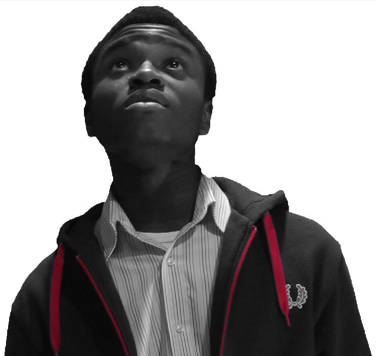
Inside Right
This cover consists of one simple image of the second singer. This singer in framed in the center of the case this is because he is the main and only point of interest of the whole side. The image has made black and whit in Photoshop and been history brushed. This means the colour to the laces to the hoodie and the zip have been put back in. This makes the reds very prominent linking to the Red writing of the title.
No comments:
Post a Comment